ROC Curve
Binary classifier are models that outputs value 0 or 1 from any input value. For instance sick or healthy, right or false, resistant or sensititive to a disease. The model attributes value 0 or 1 is made based on a threshold applied to probabilities or scores. For example, a patient may be classified as sick if the predicted probability of disease is greater than 0.8, and healthy otherwise. How do we know which threshold is the best for?
Definition
Changing the threshold affects the performance of the classifier. For instance, a lower threshold will identify more positive cases, increasing sensitivity, but it will also increase the number of false positives, reducing specificity. Conversely, a higher threshold increases specificity but may miss true positives, reducing sensitivity.
The ROC curve (Receiver Operating Characteristic) is a visualisation of the trade off between sensitivity and specificity for every thresholds. The ROC curve plots:
- Sensitivity (True Positive Rate) on the y-axis.
- 1 − Specificity (False Positive Rate) on the x-axis.
Each point on the curve therefore corresponds to a different decision threshold. A perfect model will produce a curve that rises rapidly toward the upper-left corner, corresponding to maximum sensitivity and maximum specificity. A random classifier, in contrast, produces a diagonal line.
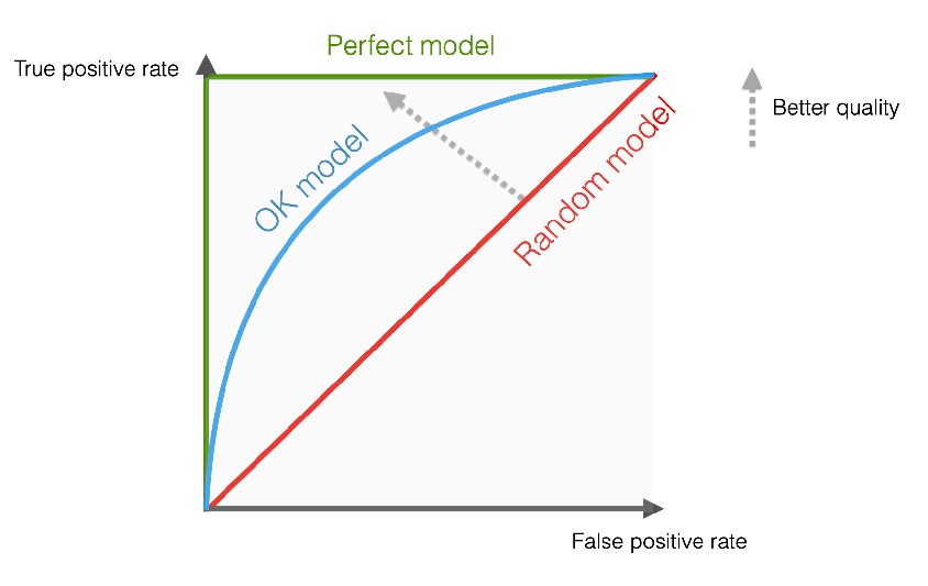
The performance of a classifier can be summarised by the AUC (Area Under the Curve). An AUC of 0.5 indicates performance equivalent to random guessing, whereas an AUC of 1.0 corresponds to perfect accuracy.
Example
During my internship at INSERM Unit S1134, Macromolecular Biology under supervision of MM Yassine Ghouzam and Jean-Christophe Gelly, I have to work on the optimization of a predictive model for 3D molecular structures of protein at atomic resolution. The model's name was ORION. To assess the performance of ORION compared with PSI-BLAST and HHsearch, we compared 1032 predicted structures with their original structures for each method. For each query, the methods give a ranked list of proteins from the database. Proteins are ranked by E-value for PSI-BLAST, probability for HHsearch and raw score for ORION. The true positives (TPs) and false positives (FPs) were counted considering the classification level of interest. A TP was denoted when the two proteins compared belong to the same class level and a FP is counted for hits within different class levels. Each protein is then labeled as TP or FP in the ranked list.
By applying the formula it is possible to calculate the True Positive Rate (TPR) and False Positive Rate (FPR) for each ranked proteins. The ROC curve is the plot of TPR as x-axis and FPR as y-axis.
References
ORION : a web server for protein fold recognition and structure prediction using evolutionary hybrid profiles
Yassine Ghouzam, Guillaume Postic, Pierre-Edouard Guerin, Alexandre G. de Brevern & Jean-Christophe Gelly
Scientific Reports. 2016 Jun 20. DOI: 10.1038/srep28268
Relevant Tags
About the Author
Latest Articles
-
Research Tax Credit
The Research Activities Tax Credit is a tax credit that incentivizes private companies to increase their Research and Development (R&D). Within my company, I have been tasked with writing the Research Tax Credit (CIR) justification report for France. Here, the method for writing such a report.OCT 2025 · PIERRE-EDOUARD GUERIN -
Turing Complete: From Logical Gates to CPU Architecture
In 2021, LevelHead published Turing Complete, a game about computer science. My friend Christophe Georgescu recommended me to play it. Unfortunately, I took his advice and now I can not stop to play this game! The game challenges you to design an entire computer from scratch. You start with basic logic gates, then move on to components, memory, CPU architecture, and finally assembly programming. By the way, the game is neat and present all these concepts in a playful and intuitive way.SEP 2025 · PIERRE-EDOUARD GUERIN -
How to Manage a Project?
In any company, every task is part of a project. I am responsible for managing multiple projects each year. I have to present deliverables to stakeholders, meet deadlines, allocate mandays and coordinate everyone’s actions. This is a meticulous work that requires a strong methodology.JUN 2025 · PIERRE-EDOUARD GUERIN